TL;DR
Ken breaks down the VFX behind Magnet Forensics’ Axiom video, from planning a shoot around visual effects to wrapping one investigator in a 360° world of digital evidence.
Hey hey! I’m Ken, and I’m one half of the animation and visual effects team here at Arc. With today’s blog post we’re going all the way back to the spring of 2022, and a video our team produced for Magnet Forensics. My goal here is to give you a peek behind the curtain into what goes down in the post-production world at Arc Media. I’ll walk you through how we plan and shoot for visual effects, and some of the creative and technical decisions I make to ensure the graphics are telling the intended story.
The Ask
Create a short promotional spot for Magnet Forensics’ Axiom platform: something fresh and exciting that still sits unmistakably inside Magnet’s established visual identity.
The Journey
Magnet Forensics is a client we’ve built a great working relationship with over the years, working alongside them on several live-action, animated, and hybrid promotional videos. So we came into this project with a clear, strong visual identity already established. That’s obviously useful as a launching-off point. But it also presents a unique challenge: creating something fresh and exciting within well-trodden territory. Making something novel that still feels Magnet.
The project in question was a short promotional spot for Magnet’s Axiom software platform, which can be viewed at the link above.
The graphics in this video (some lifted directly from previous Magnet videos) fall squarely within the established visual identity: blues, whites, screen-like glow effects, varied transparencies, kite-shaped connection maps, and a recognizable set of icons. In the next few sections, we’ll break down specific scenes from the Axiom video: how we took inspiration from existing Magnet work, designed shots to accommodate extensive motion graphics, and implemented those graphics in a way that supports the overarching story. I’ll also do my best not to bore you with (too many) ultra-specific technical details.
The Establishing Shot
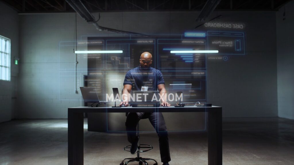
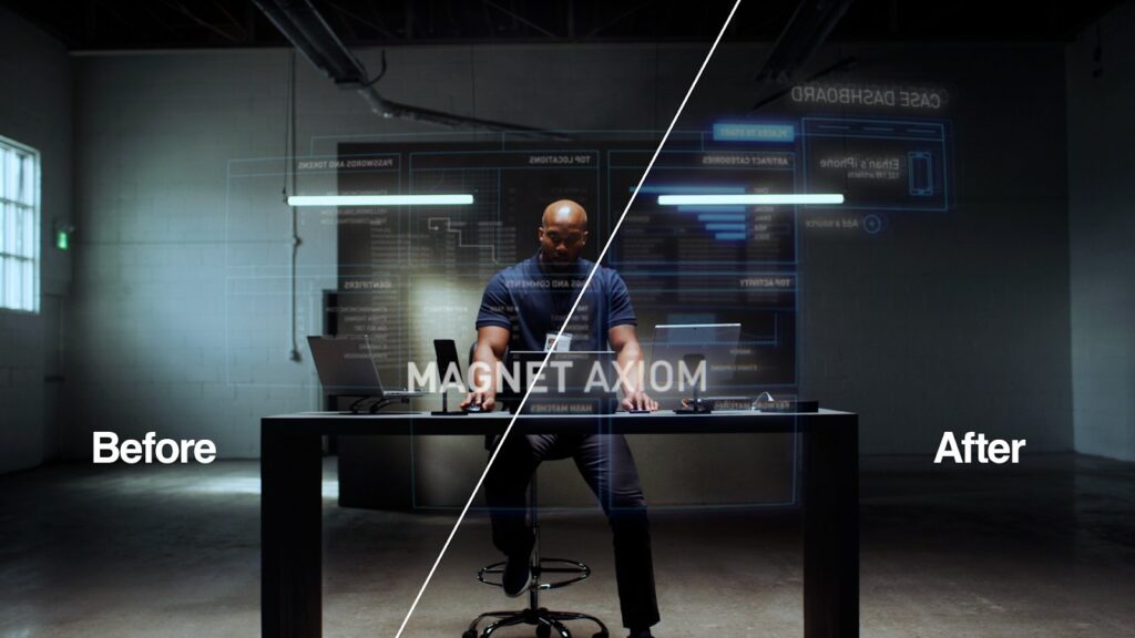
We kick the video off with its clearest example of shamelessly lifting a design from past Magnet work: the entire Case Dashboard graphic was built years ago for an earlier Magnet project. It’s received a few minor updates over the years, but its bones have remained wholly unchanged. This time, though, we wanted to recontextualize the dashboard and use it to surround our investigator with visualized data.
To pull that off, the seed had to be planted early. Right from the storyboarding phase, we needed a clear sense of what screen real estate the graphics would occupy, and enough negative space for them to exist without crowding the edges of frame or feeling out of proportion with our character. We also needed a backdrop free of distracting objects and textures, and scene lighting that would let the graphical elements shine without washing them out.
With those considerations locked, when the cut finally landed at my workstation, my main job was to style and place the graphics to establish two feelings at once: immersion and order. There’s an abundance of data at this investigator’s fingertips. But thanks to Axiom, he’s always in total control. That visual story runs the video’s entire runtime, so it had to land clearly from the first frame. I placed the graphics on several parallel planes, both in front of and behind the investigator: the dashboard layer inverted in the foreground, as if oriented toward him with the camera shooting through it; the Magnet Axiom logo front and centre for an immediate brand hit; and additional UI panels behind. The final touch was a slight curvature on the foreground panel, a small detail that pushed the whole composition from “flat panels in space” to a real three-hundred-and-sixty-degree blanket of information.
Technical aside
Here’s a nerdier tidbit (skip ahead guilt-free if that’s not your thing). Apart from the obvious blur and glow effects, what really sells the digital, almost holographic look is the sparing use of chromatic aberration and 3D layering. Chromatic aberration is the slight RGB colour separation you see on digital displays. Think getting close enough to an old tube TV to see the individual pixels. A barely-perceptible aberration effect was applied to every graphic in every scene. Two duplicates were then made of each layer, each pushed ever-so-slightly backwards in 3D space. Fine-tune the opacities and voilà: glowing light trapped within an invisible pane of glass. Or Iron Man. Whichever descriptor you think is cooler.
Device Hero Shots
Next, let’s break down what I’m calling our “device hero shots,” which show up a little later in the video. Rather than focusing on our investigator, this quick series zooms in on individual devices and treats each as the main character of its own mini vignette. The tighter focus let us get much more granular with the information in the UI panels, quickly visualizing how Axiom filters an overwhelming amount of data and presents it back to the investigator in an organized, intuitive way.
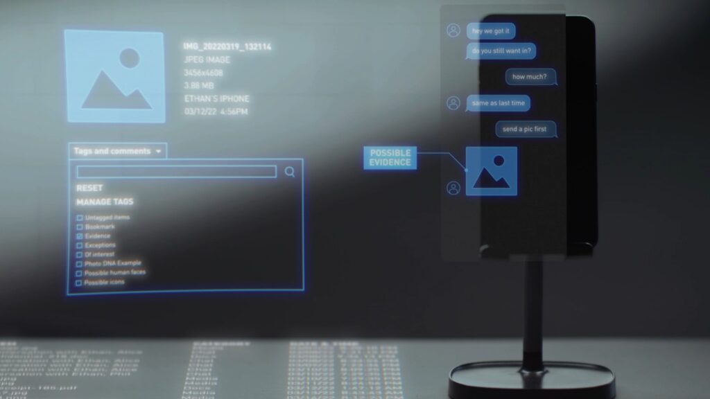
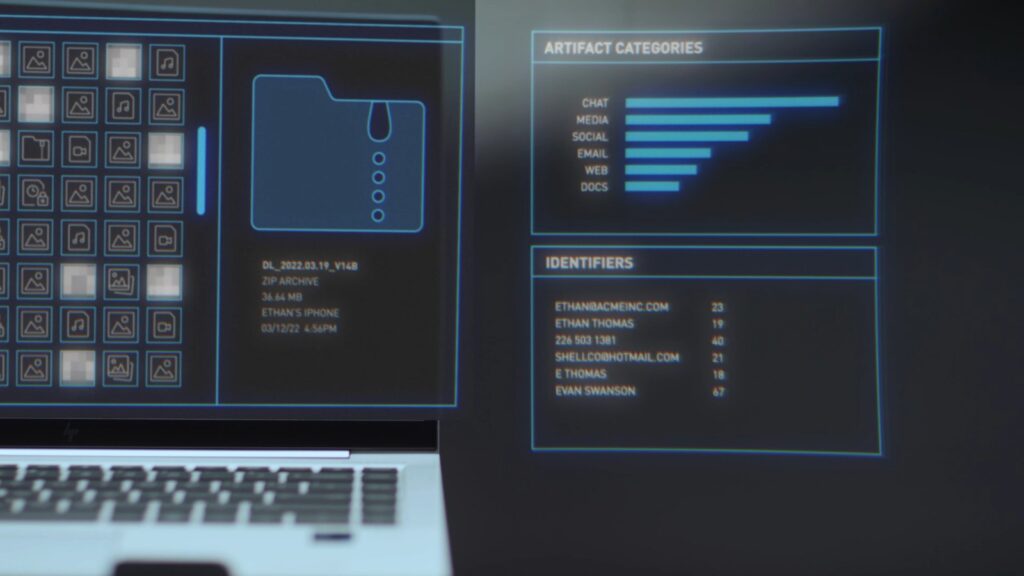
Each device gets its own mini vignette, and its own information architecture.
On the surface these compositions look quite different from the establishing shot, but the thinking behind them was nearly identical: frame the hero devices with negative space for the graphics to inhabit, and light with glowing, digital elements in mind. Here we also went for a much shallower depth of field: a blurrier foreground and background, to direct the viewer’s attention to the devices and the UI panels. When arranging the graphics, I used the parallel and perpendicular planes already present in each scene to inform the compositions, and where possible matched the falloff of the camera’s focus, tying each graphic’s sharpness to the shot’s. Decisions like these cement the graphics in the visual space: they feel like a natural part of the scene, and they reinforce that sense of order the story called for.
One interesting hurdle: pulling visual information off the devices’ screens, aligning it so it couldn’t be read as literally on the phone or laptop, while keeping a coherent aesthetic. Simply nudging the graphics away from the screens created visual tension and frankly just read as a mistake. So I dug deep into my bag of tricks (okay, not that deep… this is a go-to move of mine) and built a buffer panel with a glass-like texture from a combination of scale, blur, grain, and colour effects. It created a clean, defined boundary for the screen graphics to live in, but felt far more natural than a plain semi-transparent layer. It also just looks cool, in my humble and totally-not-biased opinion.
The Probe Lens Shot
Finally, the most interesting reinterpretation of an existing graphic in this video, and the clear standout in technical difficulty. I’m calling it the “probe lens shot,” for reasons that will become obvious shortly.
Setting the technical challenge aside for a moment: the noteworthy thing here is how the shot takes a well-established idea from past Magnet projects and recontextualizes it for a different style of video. The “kite” connection graphic has been a staple of several Magnet animations. To pull the kite out of the fully-animated world and integrate it into a live-action scene, we spread its points through 3D space and attached each one to the object it represents, with the corresponding data in a panel beside each point. This allowed us to visualize the connections between these physical devices, as well as some of the information they contain.
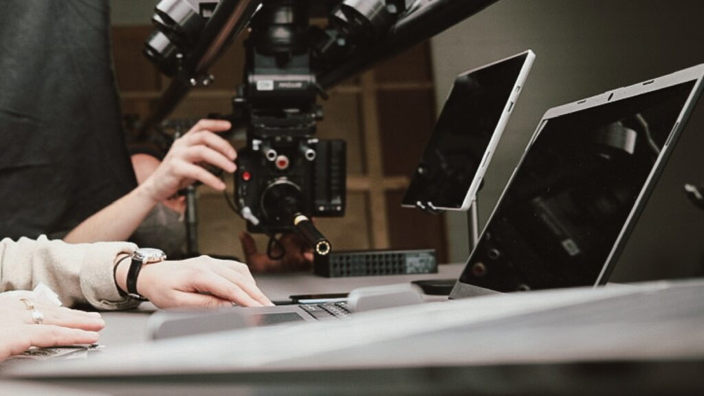
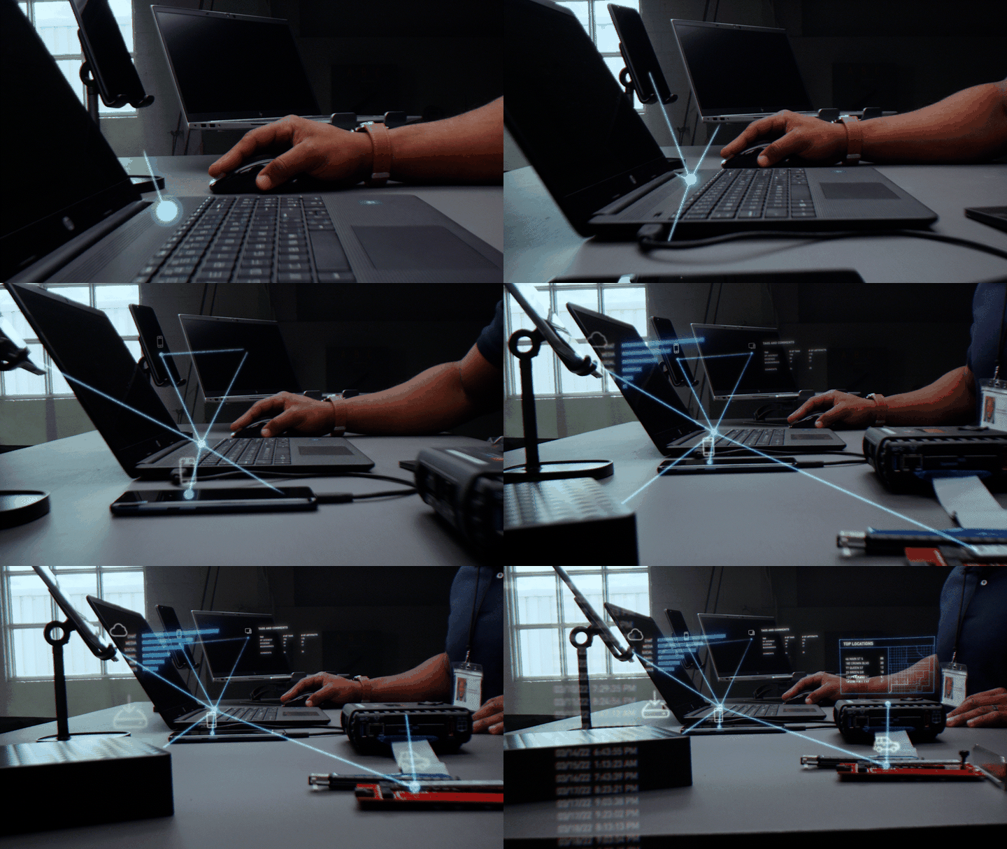
On set and on screen: the probe lens suspended inches above the desk, and the tracked graphics that shot made possible.
So what’s a probe lens? A funny-looking lens that lets the operator shoot extremely close to a subject while keeping the rest of the scene relatively in focus — and pull off otherwise impossible camera moves. This was my first attempt at tracking motion graphics into a shot like this, and… oh boy. I could write an entire post on that process, but the highest-level explanation: I needed to execute a camera solve. That is, using specialized software to analyze the motion in the scene and generate a virtual camera that follows the real one. That let me place dots in 3D space, connect them with digital beams, and hang graphics off every connection point.
Here’s the thing about camera solves, though: they often just don’t take. The more complex the scene and the more the camera moves, the less likely the software gives you a usable result, and only so much can be done about it. Armed with that knowledge in advance, we shot an abundance of “safeties”: alternate takes with varying degrees of camera motion, plus a few nuclear-option takes where the camera didn’t move at all. Thankfully, the solve took on one of the most complex and dramatic takes, and we were rewarded with a final composition quite unlike anything else in our catalogue of motion-graphics and VFX work.
Wrapping Up
So there you have it: a glimpse into how we plan and shoot for motion graphics, and the creative and technical considerations that go into pulling them off. It was a bit of a doozie, but hey — so was the project. Thanks for following along; I hope you found at least some of this enlightening, and I look forward to breaking down more of my work for you in the future.
About the client
Magnet Forensics is a digital forensics software company headquartered in Waterloo, Ontario. Its platform, Magnet Axiom, helps investigators and enterprise security teams recover and analyze digital evidence.
Arc Media is a video production company in Waterloo, Ontario. We create product launch videos, explainers and brand films for B2B software and technology companies across Southwestern Ontario.
More from us: five AI spots in one hangar-sized studio for OpenText’s Aviator.
Start something
Tell us what you’re making.
A product to launch, an image to build, a story to tell. Send a few lines and we’ll email back within a business day.